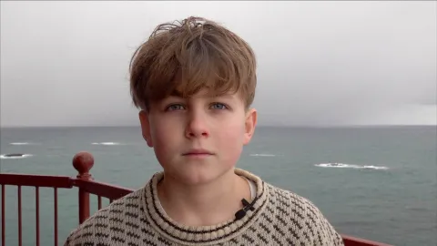
Encounter with a Graceful Giant
He was part of the graphic design team that designed the Norwegian banknotes and was behind the striking design programme for the National Museum. Christian Schnitler has now created the logo and graphic identity for The Whale.
Everything about The Whale is extremely overwhelming
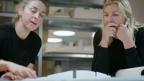
Working alongside him is type designer Maciek Marć. The two have collaborated before and even secured a prestigious international assignment when they were engaged to develop the visual identity for an event in London in the summer of 2024. The event organised by Bill Gates’ Breakthrough Energy featured the likes of Prince William, John Kerry and Bill Gates, who gathered to discuss climate challenges.
“I have wanted to work with The Whale for a long time,” says Christian Schnitler, who describes the new graphic identity as a design that “comes up for air”.
In their project with The Whale, Christian Schnitler and his team were tasked with developing an expression that works when facing all the overwhelming elements: the ocean, the light, the landscape of Andøya, Andenes, the iconic architecture and the whale – the world’s largest animal.

The Encounter
Early in the process, one crucial factor was defined – “the encounter” between human and whale, and between sea and land.
Right from his first trip, the focus was on experiencing the whole island. He set off on an express tour around Andøya with members of the project team to gain a real sense of life on this majestic island. Along the way, he was struck by the contrasts such as the mountain peaks, waves and flat expanses, and by the people that he met in various shops, businesses and cafés like Marmelkroken in Bø and Alveland in Dverberg. This became a unique way of getting to know the “skeleton” of Andøya as they aimed to translate the place into a visual expression.
Avoiding the Obvious
Early on, the design team and leadership at The Whale agreed to steer clear of the most obvious symbol: the iconic whale tail. They did not deem it “wrong” but simply overused. From the outset, The Whale was meant to stand out as something unique.
“We needed to find a more organic movement and form that depicts the whale, the landscape and the encounter between humans and whales without becoming a cliché icon,” says Schnitler. “The Whale is unique – and the design had to be too.”

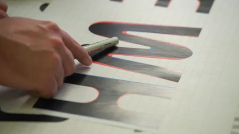
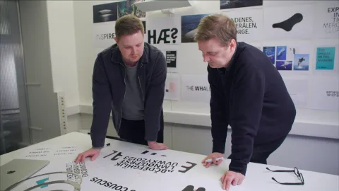
Typography is Key
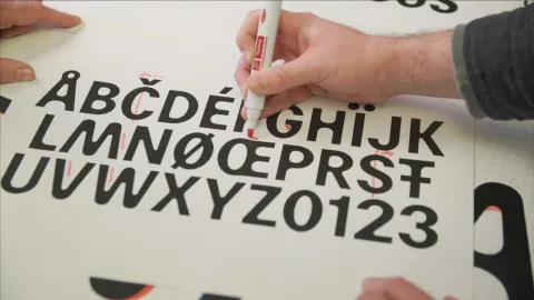
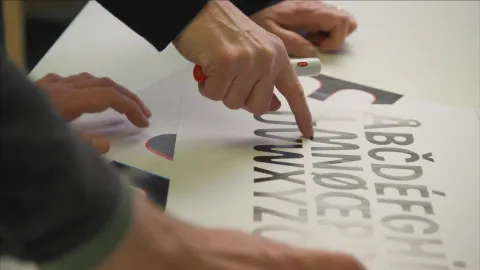
“Typography is the core – and most frequently used – element of an identity. Everything a brand communicates relies on typography in some form. That’s why we chose to create a custom typeface from scratch in collaboration with type designer Maciek Marć,” says Christian.
The typeface is inspired by the transition from underwater to above the surface, reflecting the tension of the exact moment a whale breaks the surface. Its forms can shift from thick to thin and from power to stillness. It works equally well both statically and in motion across digital platforms.
A Major Undertaking
Maciek Marć has put an enormous effort into developing a complete alphabet: Whale Grotesk. This typeface has been created exclusively for The Whale. It’s a display font used for the largest and most prominent headlines – including on the website – where the expression carries the brand’s identity.
The Colours of Andøy
The colour palette in the design programme is drawn from nature on and around Andøya: the turquoise and green of the sea, the vibrant green of the Northern Lights and a warm pink/orange inspired by the refraction of sunlight as the sun nears the horizon and sets into the sea. The colours are also inspired by calmer natural surfaces, such as beige sand, says Schnitler.
A Graceful Giant
“The whale is the world’s largest animal. It’s gigantic, yet it moves with remarkable grace through the water. We have tried to capture that contrast – from heaviness to lightness and from below the surface to above,” says Christian Schnitler.
“The visual identity is just like the whale: it rises to the surface for air, to breathe and to communicate with the audience and visitors.”
Behind the scenes towards opening